An online space to keep all those design finds we say 'that's nice' to. Could be anything design related from typography to fashion to commercials to wrapping paper. Enjoy the randomness and be inspired.

Wednesday 15 December 2010

Design and typography blogs

It's been one of those rare mornings where I've had the time to browse the internet and came across these two blogs... which have kept me busy for hours looking through all the nice work on them.

www.designworklife.com

www.typographyserved.com

Friday 3 December 2010

Shop Vac - Music video

There's a lot of kinetic typography about these days so it's always great to see some examples that really make you smile and say wow! This video for Jonathan Coulton's song Shop Vac was designed and animated by Jarrett Heather... (who is also a wonderful pianist, so as it's nearly christmas check out this link - Have Yourself a Merry Little Christmas.)

I'm going off track! Back to Shop Vac... enjoy!

Wednesday 3 November 2010

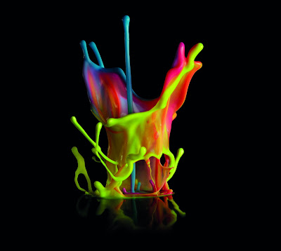
Canon - Bringing Colour to Life


This is quite simply amazing... for me this was like listening to a piece of music that makes you feel all tingly inside... Creative studio dentsu, and photographer Linden Gledhill have created a visual masterpiece.
View the making of this new Canon ad followed by the commercial itself... here!

(Thanks for the link Jack!)

Thursday 7 October 2010

Tips and tricks for adobe illustrator

I know there are hundreds of tutorials on the net for different programmes but I've just found this particular link very useful so hopefully you will to...

10 useful tips and tricks for adobe illustrator

Wednesday 15 September 2010

Can you handle it?

My mum passes on a lot of spam email to me but this one caught my eye! Creative carrier bags..! Here's a few of my favourites...


Friday 3 September 2010

Threadcakes - yum yum

We've all heard of Threadless t-shirts, but have you seen Threadcakes where the t-shirt designs are turned into cakes! genius..! well some of them are - here's a few to whet your appetite...


15 Pretty Cool Typographic Film Posters (part 1)

I saw a very cool typographic film poster the other day, so cool I can't remember the name of the film(!) I should have posted it on here straight away. Whilst trawling the world wide web trying to find it I came across some other examples of great typography in film posters. So here's a few of them... I'm planning to do a Part 2 to this post so please pass on any suggestions and in the meantime I will try to find the original poster I was after!


Wednesday 18 August 2010

She Says Loves - That's Nice Design

That's Nice Design blog is featured on SheSays!

She Says in a community recognising females (and the lack of them) within the creative departments of digital agencies. They run monthly networking events and even run their very own awards - The Golden Stillettos!

Click on the link to find out more and get involved.


Friday 6 August 2010

Martin Wilson contact sheets

Check out photography blog, PetaPixel - useful reviews and fabulous links to interesting photography projects like this one...
UK based photographer, Martin Wilson makes clever works of arts from contact sheets.


Thursday 5 August 2010

Project Morrinho all finished

As promised, here's a few more images from the finished Project Morrinho on London's South Bank. Festival Brazil runs until the 5th September so go check it out!


Edinburgh Fringe Festival Poster


Back in March That's Nice Design posted on this fun idea for the Edinburgh Fringe Festival front cover... people tweeted their ideas for what they would like to see on the cover and the amazing Johanna Basford illustrated the ideas live as the whole process was streamed over the internet.
I'm honoured to say that my suggestion of a dancing robot monkey wearing boxers shorts made it on the g (just above the penguin!)

For more information visit the Edinburgh Fringe Festival website or johannabasford.com


Tuesday 27 July 2010

Hannes von Döhren


Interesting interview with German typographer Hannes von Döhren on myfonts.com talking about his background in advertising, his inspiration, design heroes and love for type.

Wednesday 21 July 2010

Project Morrinho


Now for something a little different... Project Morrinho is a community project based out of the Pereira da Silva favela (slum) in the Southern Zone of Rio de Janeiro. Local people and children build miniture urban landscapes as escapism from the harsh realities of violence and corruption that is often associated with the region.

As part of London's South Bank Festival Brazil, the project has a prime spot on the South Bank building a landscape inspired from the tower blocks of Lambeth to the backstreets of Rio.

This photo was taken during the construction. Walking past each day seeing the progress was fascinating and I'm looking forward to updating you with a finished image soon.

For more information check out the links below:

Long time no posts..!?

Sorry for the lack of posts lately, I got distracted by the world cup, holidays and work!

Tuesday 15 June 2010

World Cup Poster


If you are fed up with those everyday newspaper pull out wall charts helping you record every score from the World Cup then purchase one of these, quickly... we are already 5 days into the finals. Designed by David Watson of Trebleseven, these colourful typographic posters are only £7 from Magma. And all proceeds go to Soccer Aid UNICEF. How can you resist?


Added note: it's also available to buy from the Trebleseven website directly (thanks David)


Monday 24 May 2010

Special Feature - Robots are Awesome by Her Art She Loves

In the first of the special features on That's Nice Design I caught up with the self penned "Jane-of-all-trades" over a virtual coffee and cake to discuss her super cute robots.

Based in the USA, Her Art She Loves is an illustrator by day creating stock vector images and reformating genre comics for iphones. But as if that's not most people's idea of a dream job she started turning her drawings of robots into mini works of arts and now sells her masterpieces online at RobotsAreAwesome.etsy.com

"I've worked with polymer clay since childhood, I've made random sculptures off and on for years. When I began drawing digital robots, I tried my hand at making one out of polymer and wire. I really enjoyed making my first robot (pictured below left) and haven't stopped since."


It was probably unintentional but these robots have such a universal appeal, females, males, children, art lovers and yes geeks will all find it very difficult to not full in love with at least one of them. Which bought me to the question:
Have you ever made a robot that you just couldn't bring yourself to sell because it was too cute?!
"Yes, Teal Plumply (pictured above right) He was the first robot that really came together, I love his colors and he inspired me to make more."

The robots creator is a self confessed Star Trek and Doctor Who fan, and has always been inspired by that genre in her work. I asked her if she would like her robots to take over the world but it seems the main aim is for people to buy a robot, place it on a shelf and just make people smile. And with each robot branded with a heart "Because we all need a little heart in life!" it's surely impossible for her mission to fail.

I for one, am a robot convert. I have probably never described robots as awesome in my life until now... awesome, playful, adorable, intricate, lovable, colourful bots... I could go on.


To see more Robots Are Awesome from a very cute bride and groom to a rabbit bot go to the flickr page


What do you think of Robots Are Awesome? comments please!
Wednesday 5 May 2010

Eliot Kid is a stylish little fella


I 'accidently' turned on children's TV this morning instead of the usual breakfast election news, and found myself captivated by a title sequence for Eliot Kid. It's cute yet sophisticated style goes to prove that not all kids graphics need to be brash colours with big 3d type.
This isn't the best quality movie but check it out on BBC2 at 7.15am

Tuesday 4 May 2010

Rob Ryan


If you ever get a chance to see Rob Ryan's studio you must go. From the 23rd April to 3rd May he had his studio set up in Somerset House as part of the Pick Me Up festival. Seeing the intricate nature of the work and the cut outs so close up just makes you appreciate the work even more.

Monday 19 April 2010

Heydays - Norway

Here's another cool design company from Scandinavia, Norway this time. Some nice clean branding and typographic work.

http://www.krop.com/heydays

Julien Vallée - that's nice!


You know when you say WOW to something that it must be good. Check out Julien Vallée's extraordinary work!

Thursday 15 April 2010

Chevychase Sweden


I'm a big fan of Swedish company, Chevychase. Great branding projects, great typography, great use of colour and a great name!

Tuesday 13 April 2010

50 retro and vintage websites...


Thanks to Roger for the link (http://thatssodigital.tumblr.com)
Here's a fabulous array of retro and vintage styled websites to get those creative juices flowing.

http://www.webdesignledger.com/inspiration/50-retro-and-vintage-web-designs-to-inspire-you

Thursday 8 April 2010

Negative space in logo design


Slightly old post this from logo design love but I find myself coming back to it time and time again... some great examples of using negative space in logo design

http://www.logodesignlove.com/negative-space-logo-design

Tuesday 30 March 2010

Meredith Dittmar polymer work


Beautiful polymer work by Meredith Dittmar at Corporate Pig. They would work really well as illustrations but bringing them to life with the modeling is quite stunning.